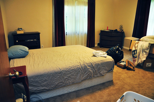
For the past few weeks since we moved in, we have been sleeping on a stacked mattress and box spring. Romantic huh? I left our old bed on the curb. We’ve wanted a new bed for some time, but with the move impending, and not wanting to risk damaging new furniture, we decided to wait until we were settled and could have a little time to decide the look and feel for the bedroom. Here’s where things get tricky…
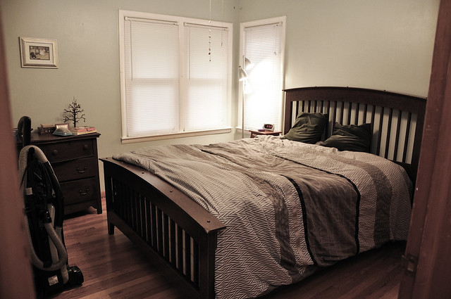
Old bed in our old room.
Confession: We know nothing about interior design. Nothing. I know all the blog experts will tell you to “fake it till you make it” and have a sense of “authority” on the topics you are covering, but I’m here to tell you that’s bunk with us. We don’t know what we’re doing. We’re the newbiest of newbs. I’m telling you this now because I hope it will change with the trial and error process of owning a home, and I hope the process of discovery and humor of occasional (fingers crossed) error in all this will be interesting to you. Sure, we know how to research and select the best television for our needs, but designing the actual aesthetics of the room? One word, EEP!
I think one of our biggest areas of difficulty is actually deciding what it is we like and how to form that into some kind of unified aesthetic. We like a lot of things, and a lot of the things we like clash horribly. We don’t really have a unified “us” aesthetic. It’s easy to go on your favorite design blogs and say, “well this person has this, I’ll get one too,” but is it really “you”? For instance, I love reading Young House Love. I’m constantly inspired by how much they’ve been able to do themselves and I hope we’ll be able to do the same with our new “baby.” But their aesthetic is SO. Not. Us. We like a balance of feminine and masculine influences, and we prioritized (via pinky swear) early on that whatever the final product ends up being, it would strike as close to that balance as possible.
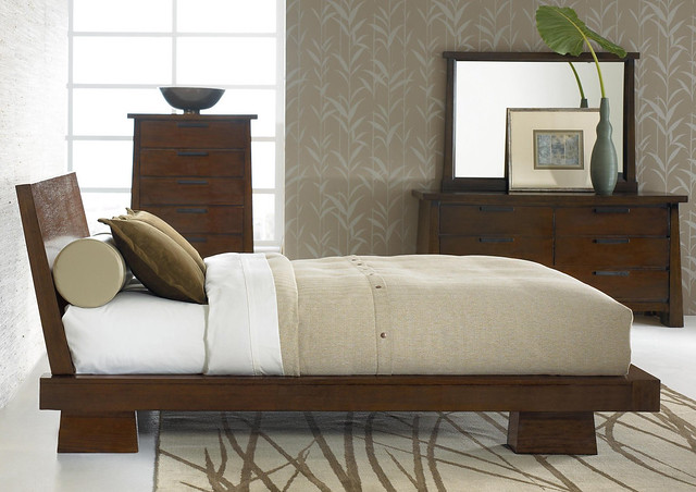
With all that in mind and five furniture stores’ worth of inventory in our wake, we finally selected a bed last week that will be delivered and assembled this Saturday:
Meet Hilda. We really wanted some variation of a platform or low slung bed that wasn’t completely on the ground, but was lower than typical beds, mainly so Clive can come and go as he pleases and the room isn’t centered by a tall boxy island of bed. We also wanted to ditch our box spring if possible, because I’ve never liked the stacked look of both a mattress and box spring. It is a deep color that is neither too light nor too dark and is reminiscent of a lot of the mission-style furniture my family owns. However, it is also modern and a little dynamic. The showroom accented its display with a lot of modern accessories, and it looked phenomenal, so we’re kind of using it as a guide with accessories:
1. Hilda Platform Bed via Lifestyles Furniture or SimplyPlatformBeds.com. 2. Big Dipper Arc Lamp via CB2 3. Jack Table Lamp via Crate and Barrel 4. Hilda Nightstand via Lifestyles Furniture or SimplyPlatformBeds.com
Since we don’t want a super-matchy bedroom configuration, we’re going to do our best to incorporate our existing furniture into the new set-up by painting and refinishing and buying some new hardware and accessories. Those exciting adventures start this weekend and we’ll be sharing the progress with you as they happen.
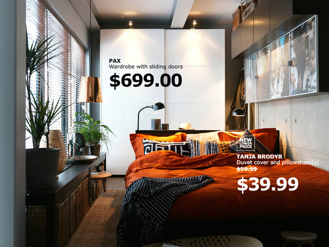
All in all, the look we’re kind of going for is this:
Image via Ikea
We really like the look of darker furniture with modern accessories and points of contrast. It’s probably a theme we’ll carry throughout the house as we go along. We are beyond excited to see how the new bed changes the look of the room, but are relieved just to have a bed to sleep in at night. Next up: after pictures, paint ideas and window treatments!
Want to drop some ideas or suggestions our way, don’t hesitate to drop us an email!
You may also like






Just let me know when I need to help. We are opposites in thus way-I am so not techy but damn can I decorate a room!
I’m stumped on paint, I can definitely use some advice. I’ll get some pics up soon!
Love the new furniture! I can’t wait to see an “after” pic! 🙂
thanks! Once I get all the laundry picked up, I’ll snap a few shots!
Love the bed! Great style.
Thanks! We fell in love with it the moment we saw it.
Super cute Jessica! Can’t wait to see it in your room!
Thanks! I had hoped to have pictures up sooner, but we’re still waiting on the lamp to be delivered.