My mom is currently in New Ulm visiting my aunt and uncle, and she asked if I would take a few pictures of the furniture we received from my grandparents estate as it looks in our house. Even though it’s forever a work in progress, things are shaping up quite nicely over here, so I thought I’d share the progress with you too. Let’s start with the dining room…
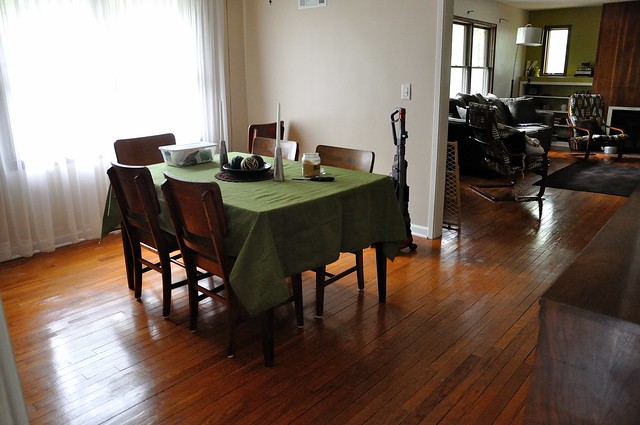
Here is the view as you’re coming out of the kitchen. We only have two pieces in here, my grandma’s dining room table and the matching buffet she received as a wedding gift. They are in amazing shape, and they fit this room perfectly. Still working on accessories, and I can’t wait to paint in here. I hate the flesh-colored paint.
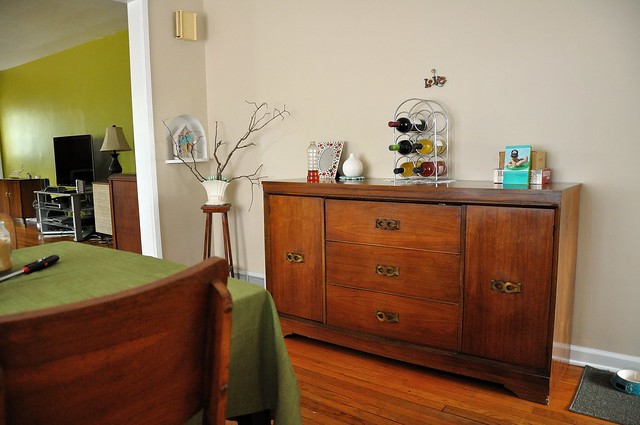
A shot of the buffet. I was cleaning in here when I stopped to take pictures, so that’s why the vacuum and furniture oil is out. Ignore the sticks and the weird love ornament, they are for something I’m working on. Oh, and we’re also looking for a wall-mounted wine rack, any suggestions?
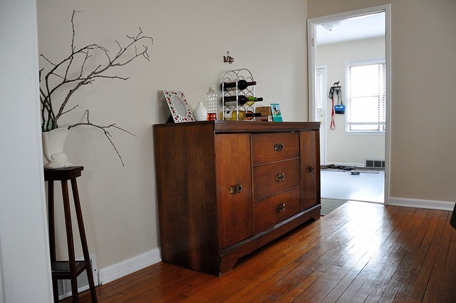
A shot from the other side looking into the kitchen. I someday envision it looking like this.
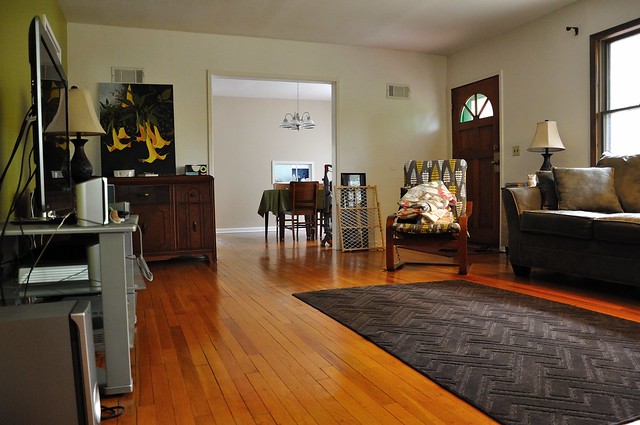
And the living room. The green looks really bright in these pictures, but I’ll take it.
I’m so indecisive that we’re still without curtains, any suggestions? Obviously probably a solid or really faint pattern? I’m so paranoid about things clashing or not looking good, that I just don’t do anything, which looks equally as bad! Next year I’d like to finally replace the car-sized couch with something grey and a little bit more demure.
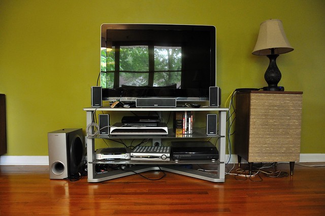
Incidentally, we just finished the final requisite task to making some more furniture swaps around last night. We received the last of the server supplies from Newegg and Neil got everything set up downstairs, eliminating the last cord we had running from the TV to our computers upstairs in the loft. So now we can ditch the metal TV stand and replace it with the buffet that used to be in the dining room.
The current media center configuration, total cord city right? Such is the life of people who work in IT…
Remember the “Terror Room”? It’s looking a little better these days as well…
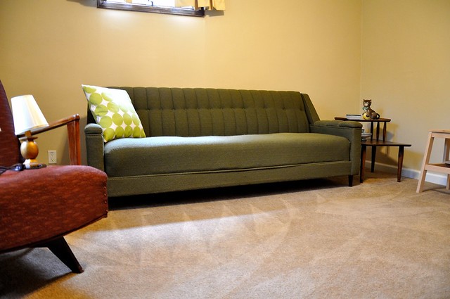
Through some miracle, we managed to find the one angle that allowed us to eek this couch into this bedroom. We had to remove the door, and we lost some paint on the door frame, but that’s all fixable right? We’ve come to the conclusion over the past few months that apparently old houses weren’t designed with furniture-moving in mind. Apparently in the magical era known as the ’50s, furniture just appeared in rooms. You also only needed on income to live off of. Fantasy I tell you. We have some patching to do, but it was worth it. This couch was in my grandparents basement, and we had more late-night slumber parties and holidays down there than I can count. Hope our future children like it because it is likely to never leave this room again. For now, this room is going to be a cozy den for us to watch movies and game in.
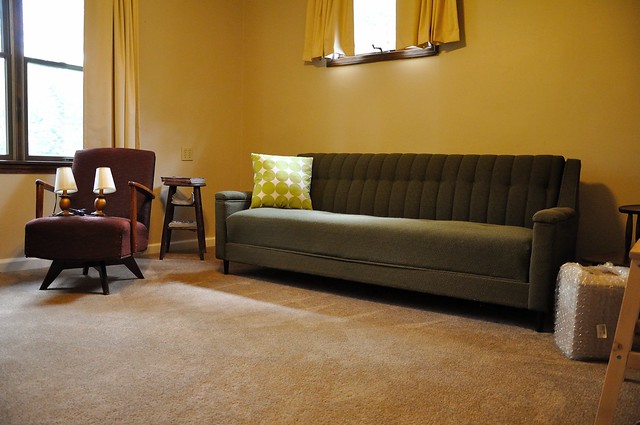
Another angle. The side chair and table are a nice tough. Eventually I’d like this room to be kind of bright and funky, yet softly-lit, like this.
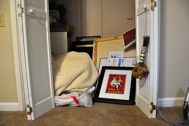
And lest you think I totally have my shit together now, let me let you in on a little secret. The closet is still FULL of our pictures and wall-hangings. Yup, still haven’t hung a single thing.
So looking better, yes? Any suggestions for us?
You may also like








I love how your stuff matches the era of your house – but without looking dated! That’s something we’re working on too; our house is from 1900, so we would feel weird going too modern, but I also don’t want to look like it stepped out of an engraving. Also, that side chair in your hang-out room is particularly awesome.
Thanks Camille! Yeah furniture has been a big struggle as you’re right, you want it to look modern and contemporary but still appropriate for the house. I don’t know if you’re on Pinterest, but it helps a TON in keeping us on track with what our desired “look” is.
Everything is looking great! The green isn’t the color I’d usually pick for walls, but I really like how it looks in your house.
For curtains, i think a bold pattern would be awesome– maybe in black and white or something? Just something to contrast with the green!